Chapter 2. Basics
Prior Version: Prism 1.14.7 User's Guide Chapter 2. Basics PDF
Current Version: Prism 2.3 User's Guide Chapter 2. Basics PDF
This topic has information about:
- Starting/exiting Prism
- Navigating the different areas of Prism
- Configuring Global and Node Preferences
- Configuring Security for employee groups
- Working with records and documents
- Document Lookup Basics
- Printing documents
- Tag printing
Start/Exit Prism
Double-click the Proxy icon for your device. Note: Windows 10 users, use the right-click "Run as Administrator" option. A web browser will launch and display the Prism login screen. The server to which you are connecting is displayed in the lower-left corner of the login dialog.
Enter your username and password and touch or click the Login button. Prism loads and launches.
Default username = sysadmin
Default password = sysadmin
By default, the main menu of the POS module is displayed. Click New Transaction to start a new transaction. To navigate to a different area, touch or click the Retail Pro button and then select the desired area from the Prism Menu.
Sample POS main screen:

Exit Prism
1. Touch or click the Retail Pro button at the bottom right of the screen.
2. Select Logout.
Navigating Prism
Prism has three main areas:
POS: This area provides access to point-of-sale activities including creating transactions, managing customers, and running end-of-day reports.
Store Operations: This area provides access to a variety of features that are normally considered "Backoffice" activity. This includes:
- Managing inventory
- Ordering merchandise from vendors and receiving that merchandise
- Transferring merchandise between store locations
- Managing employees and employee groups.
Admin Console: This area is for configuring Prism via preference settings. The Prism preferences enable users to customize the workflow and user interface. This area is also where users configure settings for replicating data between locations (e.g., for sending transactions from a store to headquarters).
When a user first logs in to Prism the POS main screen is displayed. Across the top of the screen are buttons for sub-areas in POS: POS, Customers and X/Z-Out.
Prism Menu
The Prism Menu provides access to the main areas of Prism. To display the Prism Menu, click the Retail Pro button in the lower-right corner of the screen.

Preferences
Preferences enable you to configure the Prism interface and workflow to best suit the needs of your business. Changes to preferences can be made at the Global, Subsidiary, Store, or Workstation level. Preferences are divided into two groups: Global and Node. Global Preferences apply to all subsidiaries and stores. Node Preferences can be configured and applied at the subsidiary, store, or workstation level. Some preferences are restricted to being defined at the subsidiary or store level. To access preferences, navigate to Admin Console and select Global Preferences or Node Preferences.
Working with Documents and Records
On documents and records, users (based on security permissions) have access to a consistent set of buttons and controls for adding/editing/deleting records.
Action Buttons
This set of buttons is displayed along the bottom of the transaction form. These buttons provide access to common tasks for transactions.
| Button | Description |
|---|---|
 |
Select this button to start a new document or record. This button is only available when RP Prism is in non-edit mode, such as after canceling a transaction. |
 |
Select this button to save the current document or record. This button is a toggle button with the "Edit" button. That is, when you click "Save," the button changes to "Edit," and when you click "Edit," the button changes to "Save." |
 |
Select this button to edit the currently displayed document or record. This button is a toggle button with the "Save" button. That is, when you click "Save," the button changes to "Edit," and when you click "Edit," the button changes to "Save." |
 |
Select this button to cancel the current document or record that is in progress. On transactions, if you select the Cancel button, a prompt will ask if you want to discard the transaction or place it on hold. |
 |
Select this button to hold the current document that is in progress. The transaction will be added to the list of pending transactions. |
 |
Select this button to copy the current document or record. This button is only available when Prism is in non-edit mode. |
 |
Select this button to print the currently displayed document or record. |
 |
Select this button to display a menu of options specific to the current record type. |
Document Lookup
The process of searching for records and documents is consistent across Prism. Here are some the key features related to document and record lookup in Prism:
- Search elements have a dropdown for the user to select the desired value (instead of free-form entry, which is prone to typing errors).
- Pagination is applied when many records are returned.
- If the selected search element requires an operator, you must set the appropriate operator (e.g. EQUALS or CONTAINS).
- Permissions control ability of employees to lookup individual document types.
- Each document lookup area has a corresponding Grid Formats preference where you can define the available filters, default filter set, and default visible columns.
- A maximum number of 5,000 items can be added to a single document.
Document Lookup Basics
When you access an area like Purchase Order Lookup or Transfer Slip Lookup, you will see a screen that is split into two panes. The left pane is for defining search criteria. The right pane is for displaying the results of your search. (The elements on each side of the screen can be customized in Grid Format preferences. More on that later)
The Filters area (left) and Results pane (right)
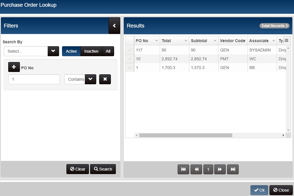
Click the Search By dropdown to see a list of the available filter elements.
Use the scrollbar or arrow keys to view the list. Click the desired element (or press

An alternative method is to start typing the name of the desired element in the text box. The list of elements is filtered automatically. Select the desired element and press
Next, select an operator for the element and enter a value. The operator that is selected will determine how the search is performed. In the example shown below, the "Modified By" element has been added to the filter and the operator is set to Equals. Clicking the dropdown displays a list of employees. The user can scroll the list and click on the desired employee to search for documents modified by that employee.
Alternatively, you can begin typing the first few characters of the employee's first name. Prism automatically filters the list. Highlight the desired entry and press
Search Element Operators
When you add a search element to the interface, you must also select an operator. For most elements, you can select the desired value from a dropdown menu. This is easier than typing the value and avoids user-entry errors.
| Operator | Description |
|---|---|
| Equals | Use this operator if you only want to include documents that exactly match the entered filter value. For example, entering a document number and setting the operator to "Equals" will return only that specific document. |
| Not equals | Use this operator to exclude documents that match the entered filter value. Note: Null values are included even if Not Equals is selected. To exclude null values, use the Is Empty operator instead. |
| Contains | Use this operator if you want to include documents that have the entered string in filter. You can use this operator with filter values like "PO No," "ASN No," etc. For example, entering "101" and selecting "Contains" will return documents numbered 101, 1010, 1011, 1012, 1013, etc. |
| Is Empty | Use this operator if you only want to include documents or records that do not have an entry for the selected filter element. This is a Boolean operator. If you select it, the user input text box is automatically disabled. |
| Is Not Empty | Use this operator if you only want to include documents or records that have an entry for the selected filter element. If the selected filter element is not empty, the document will be included in the search. This is a Boolean operator. If you select it, the user input text box is automatically disabled. |
From the drop-down, select the desired filter element. The default elements available for selection vary by document lookup area but will typically include elements like the document number, Associate, store, etc. You can change the elements available in the Search By dropdown by editing the appropriate Grid Formats preferences.
| Selection | Description |
|---|---|
| Active | Only active documents are included in the search (default) |
| Inactive | Only inactive documents are included in the search. |
| All | Both active and inactive documents are included in the search. |
When you have the desired Search elements, click the Search button. A list of matching records is displayed. The current document is excluded from the results. Note: If the results list is long, use the pagination buttons to navigate the list.
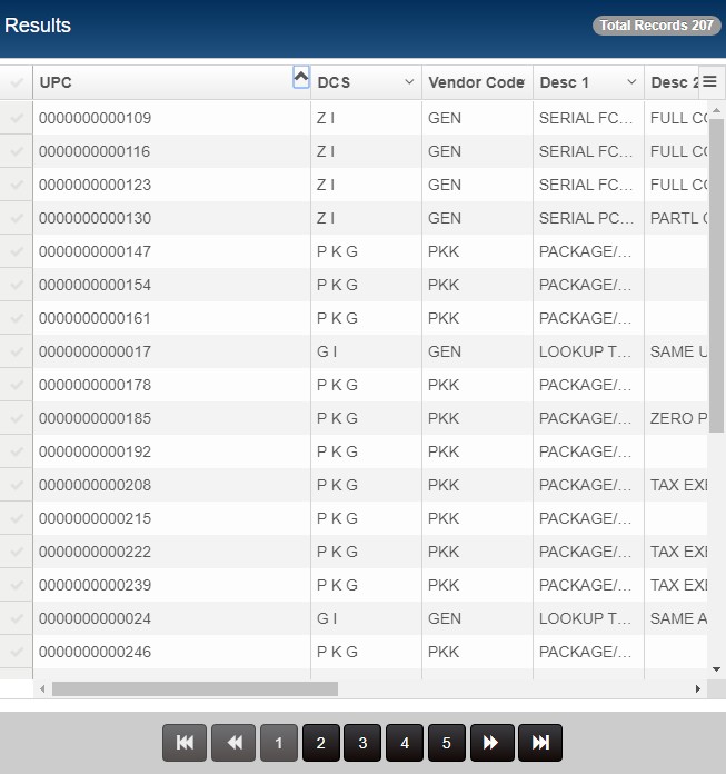
When you sort a grid column, you will now see a bold up/down arrow in the top right of the column, indicating the order of the sort (ascending or descending). This makes it easy for a user to immediately know which column is being used to sort data as well as the direction of the sort.
In the screenshot below, Inventory search results are sorted by the UPC column in ascending order, as shown by the bold arrow point up.
Sample document lookup sorted by UPC in ascending order:
Do I have to add the Search By elements to the UI each time?
No. When a user goes back into the area for subsequent searches, the same UI element used before will still be there; however, the operator is always set to the default and will need to be changed, if needed.
Wildcard Support
You can use the asterisk (*) as a wildcard character if the Search By field is a string field. You cannot use the wildcard character in number or date fields.
Beginning with Prism 2.2.1, you can use a wildcard when entering a UPC or ALU in basic item lookup. When a wildcard is entered, Prism will display a multi-match modal with the first 100 matches. This wildcard entry in basic item lookup works on POs, TOs, Slips, Memos, Vouchers, ASNs and Point-of-Sale transactions.
Document Numbers
When including the document number you can filter the document list by a range of numbers, or by whether the document has a number (ISEMPTY, ISNOTEMPTY).
When RANGE is selected as the operator, if you enter only the starting number of the range, all documents from that number to the end of the set will be included. If you enter only the ending number of the range, all documents from the beginning of the set up to and including that number will be included.
If you select ISEMPTY, the filter will include documents with a number. (Note: This is an abnormal situation. Typically, all documents will have a number)
Date Ranges
You can enter a Start Date and End Date to match documents created or modified within the date range.
Grid Format Preferences
Grid Format preferences determine the fields that will be available as filter fields in document lookup areas. The fields in the "Selected" list will be available for selection (in the desired order) in the "Search By" dropdown in Purchase Order Lookup grid format preferences:

The screenshot below shows the fields available in the Search By dropdown in Purchase Order Lookup. Notice how they match the fields in the "Selected" area of Grid Format preferences.
Show Columns
You can also customize the columns that are displayed in the Results grid and the fields that can be added to the grid by users on-the-fly. The column headers Results pane are the fields currently selected in the Show Columns area of Grid Formats.
Default Document Lookup Filters
The following tables show the default fields that are available for selection in the "Search By" dropdown in each document lookup area.
Memo Lookup
| Field | Type |
|---|---|
| Created Date | Date Range picker |
| Created By | Input |
| Memo No | Number Range |
| Memo Type | Dropdown |
| Associate | Dropdown |
| Status | Dropdown |
| Reason | Dropdown |
| Store Code | Input |
| Held | Checkbox |
Purchase Order Lookup
| Field | Type |
|---|---|
| PO No | Input |
| Vendor Code | Dropdown |
| Associate | Dropdown |
| Modified By | Dropdown |
| Modified Date | Date picker |
ASN Lookup
| Field | Type |
|---|---|
| Modified Datetime | Input |
| PO No | Input |
| Vendor Code | Dropdown |
| Associate | Dropdown |
| Modified By | Dropdown |
| Associate | Dropdown |
| Pkg No | Input |
| Tracking No | Input |
| Held | Radio button |
Voucher Lookup
| Field | Type |
|---|---|
| Voucher No | Input |
| PO No | Input |
| Vendor Code | Dropdown |
| Associate | Dropdown |
| Modified By | Dropdown |
| Modified Date | Date picker |
| Pkg No | Input |
| Tracking No | Input |
Pending Voucher Lookup
| Field | Type |
|---|---|
| Voucher No | Input |
| PO No | Input |
| Vendor Code | Dropdown |
| Associate | Dropdown |
| Modified By | Dropdown |
| Modified Date | Date picker |
| Pkg No / Shipment No | Input |
| Tracking No | Input |
ASN Lookup
| Field | Type |
|---|---|
| Voucher No | Input |
| PO No | Input |
| Vendor Code | Dropdown |
| Associate | Dropdown |
| Modified By | Dropdown |
| Modified Date | Date picker |
| Pkg No | Input |
| Tracking No | Input |
Pending ASN Lookup
| Field | Type |
|---|---|
| Voucher No | Input |
| PO No | Input |
| Vendor Code | Dropdown |
| Associate | Dropdown |
| Modified By | Dropdown |
| Modified Date | Date picker |
| Pkg No | Text box. |
| Tracking No | Text box. |
Pending Slip Lookup
| Field | Type |
|---|---|
| Created Date | Date picker |
| Created By | Dropdown |
| Modified Date | Date picker |
| Modified By | Dropdown |
| Slip No | Text box |
| From Store | Text box |
| To Store | Text box |
Transfer Order Lookup
| Field | Type |
|---|---|
| Created Date time | Date picker |
| TO # | Text box |
| PO # | Text box |
| Associate | Dropdown |
| From Store | Text box |
Printing
This section has information about printing documents in Prism, including:
Print Transaction
The Tender screen on Transactions includes a Print/Update button that is enabled automatically when the transaction is balanced. Clicking Print/Update will update the transaction and launch the print process.
Print other documents/records
Other documents and records can be printed after updating (e.g., vouchers) or after saving (e.g., purchase orders).
Configuring Print Settings
Prism has various preference settings related to printing. Refer to the following table.
| Preference Path | Description |
|---|---|
| Admin Console > Node Preferences > Hardware > Print Preferences | In this area, you can define different print settings for different areas and document types in Prism. These preferences must be set at the Store level. For example:
|
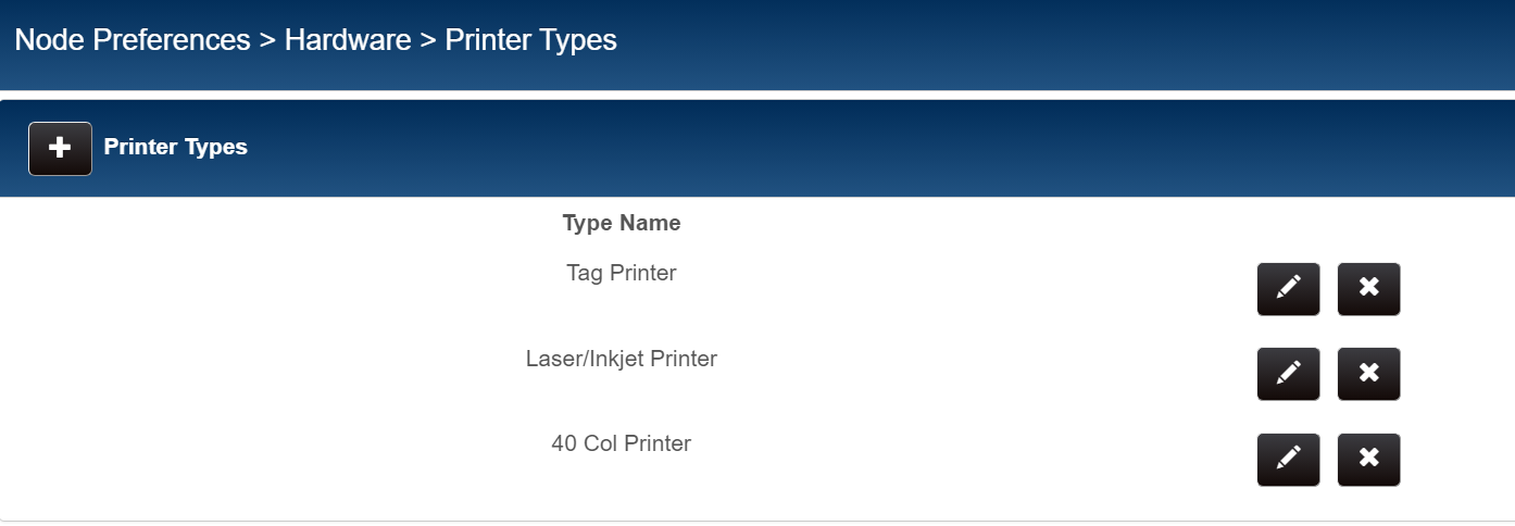
| Admin Console > Node Preferences > Hardware > Print Preferences > Printer Types | he following default printer types are defined: Tag Printer, Laser/Inkjet Printer, 40 Col Printer. You can add more Printer Types if needed. These preferences must be set at the Store level. |
| Admin Console > Node Preferences > Node Selection > [Workstation] > Printer Types tab | On the Printer Types tab of the workstation record, select from the dropdown the Printer attached to the workstation. Click the checkbox for the Printer Type of the selected printer. |
Define Print Preferences
Navigate to Admin Console > Node Preferences > Hardware > Print Preferences.
Select the desired Print Area from the menu on the left.
Define print settings for the area and save. Refer to the following table.
| Option | Description |
|---|---|
| Hid default print designs | If selected, then the default print designs shipped with the product are hidden. This will leave only your custom designs available as selections in the Print Design drop-down. |
| Default action | Select the default action to take when a user clicks the Print/Update button: Display a dialog so the user can choose an action, always email, or always print. |
| Default printer type | Select a default printer type to use. |
| Default printer design | Select the print design that will be used by default. You can change the selection at run time, if needed. |
| Default copies | This setting enables you to define the number of copies of a document that will be printed by default. Printing multiple copies of a receipt or other document is required (or desired) in certain regions. When the user prints the document, the Print dialog will already be set to print the defined number of copies. |
| Default Email design | Select the email design that will be used by default. You can change the selection at run time, if needed. For example, you might want to use a 40-column design for the default print design but use an 8x11 design as the default email design. |
| Print dialog controls | Print button, Email button, Print and Email button (two actions combined in one button), Preview button, Printer selection, number of copies, print design selection and email design selection. |
Sample Admin Console > Node Preferences > Hardware > Print Preferences:

Define Printer Types
Navigate to Admin Console > Node Preferences > Hardware > Print Preferences > Printer Types.
In this area, define the types of printers used by your store. After defining Printer Types, assign a Printer and a default design to individual printer types in the workstation record Printer Types tab. The following default printer types are defined: Tag Printer, Laser/Inkjet Printer, 40 Col Printer. You can add more Printer Types if needed. These preferences must be set at the Store level.
Assign Printer Type to Printer in the workstation record
Navigate to Admin Console > Node Preferences > Node Selection > [Workstation] > Printer Types.
Select a Printer from the drop-down and click the checkbox for the Printer Type. Save the changes.

Print Tags
You can print tags in the following areas:
- POS
- Inventory
- Vouchers
- Purchase Orders
- Adjustment Memos
- POS Transactions
When printing tags, users have the following options:
| Option | Description |
|---|---|
| On-Hand Quantity | The number of tags printed for each item will be equal to the current on-hand quantity in Inventory. |
| Document Quantity | The number of tags printed for each item will be equal to the quantity for the item on the current document. |
| Copies | Prints the number of copies specified. Users can adjust the number of copies up or down. |
Basic Steps for Printing Tags
1. Assign default print designs for each area in Print Preferences as described previously.
2. In Inventory, Purchasing, Receiving, or Transfers, select the item on the document, click the Options button and select Print Tags. When printing tags, select a tag design and the number of tags to print: On-Hand Qty, Doc Qty, or a specific number of copies. On Adjustment memos and POS Transactions there are two buttons available for printing: Print Selected Item Tags and Print All Tags. To print tags for a selected item, highlight the item, click Options and select Print Selected Item Tags. To print tags for all items on the document, you don't have to select an item; just click Options and select Print All Tags.
3. Enter or select the number of copies (Document Qty, OH Qty, or specific quantity).
4. Attach the printed tags to the appropriate merchandise.
Prism Default Tag Designs
| Design | Description |
|---|---|
| Normal Basic | Standard tag design. |
| Small Basic | A smaller tag design than Normal Basic. Useful for smaller items like gloves, socks, etc. |
| Jewelry | A small tag design that is especially useful for tagging small jewelry items like rings and necklaces |
Print Tags from POS
Price tags are typically printed when items are received, prior to being put on the sales floor. Occasionally however, Associates need to print at tags at POS. For example, a price tag might be missing or damaged too badly to scan. Note: You must first highlight or select the item on the transaction.
Click Options and select Print Selected Item Tags or Print All Tags
In the displayed dialog, select a Print Design and Printer. If printing tags at POS, select the Document Quantity radio button. You can optionally select to print a specific number of tags.